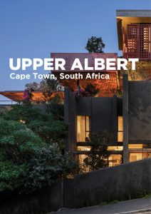
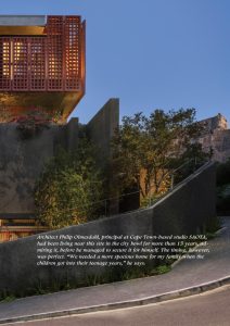
Being his own client offered Philip the opportunity to push boundaries –
combining wisdom earned designing houses with SAOTA over the years
with something a bit more whimsical and experimental. “When architects
design their own homes,” he says, “they can have a bit more fun; they can be
a little bit less intellectual”.
That doesn’t mean that the design of his own home is any less rigorously
thought-out, but rather that Philip could take the opportunity to explore
architectural ideas without necessarily feeling the need to present a definitive statement or conclusive theory and weave in personal associations and
preferences.
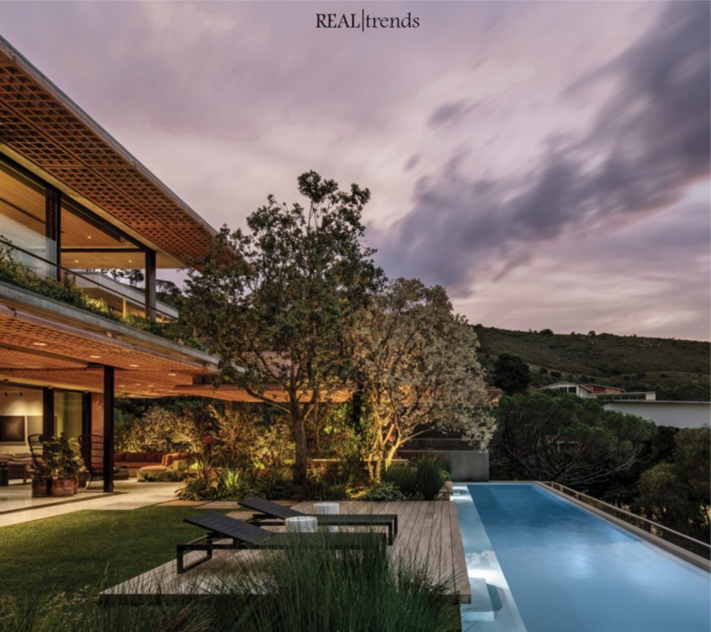
The corner site he secured was steep and had an “unmemorable” 60s ranch
style house in the centre of a large garden, as was typical of the garden
suburbs of the era. Philip points out, however, that the City of Cape Town’s
densification strategy in this area presented new possibilities. In response, he
subdivided the property along a contour and redeveloped it to create a five-bedroom family home on the upper section and two four-bedroom rental apartments on the lower.
“The objective was to create a single house that enjoyed the
activity and the energy of the city,” says Philip. At the same
time, he sought to recreate something of the spirit of a single
standalone house in a garden suburb for a changed urban
context.
Conceptually, the relationship between the main house and the
accommodation below, separated by a shared wall, references
the row houses that historically characterise the area. When it
came to designing the main house, however, instead of a garden
on the ground level, Philip extended the footprint of the house
right out to the setbacks to create a podium on the lower two
levels. “I wanted to build my garden up in the sky,” he says.
The podium includes garages with a gym, guest and staff accommodation, and utility rooms.
The upper two levels are
dedicated to the living space, which, from that height,
can take maximum advantage of the spectacular views
of the city. The third level accommodates the living area
and a covered outdoor terrace. Four ensuite bedrooms
plus a small lounge and study occupy the uppermost
level, including a generous office for Philip and a yoga
studio for his wife.
From the street, the boundary walls and plinth are
finished in grey stipple plaster, which is a reference to
Cape Town’s mid-century residential buildings and is also
associated with the campus of the University of Cape
Town and its prominent place in the city’s architectural
heritage.
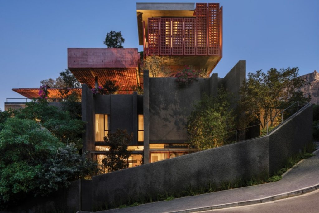
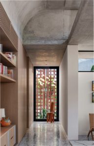
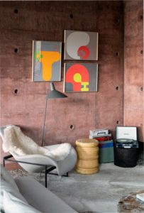
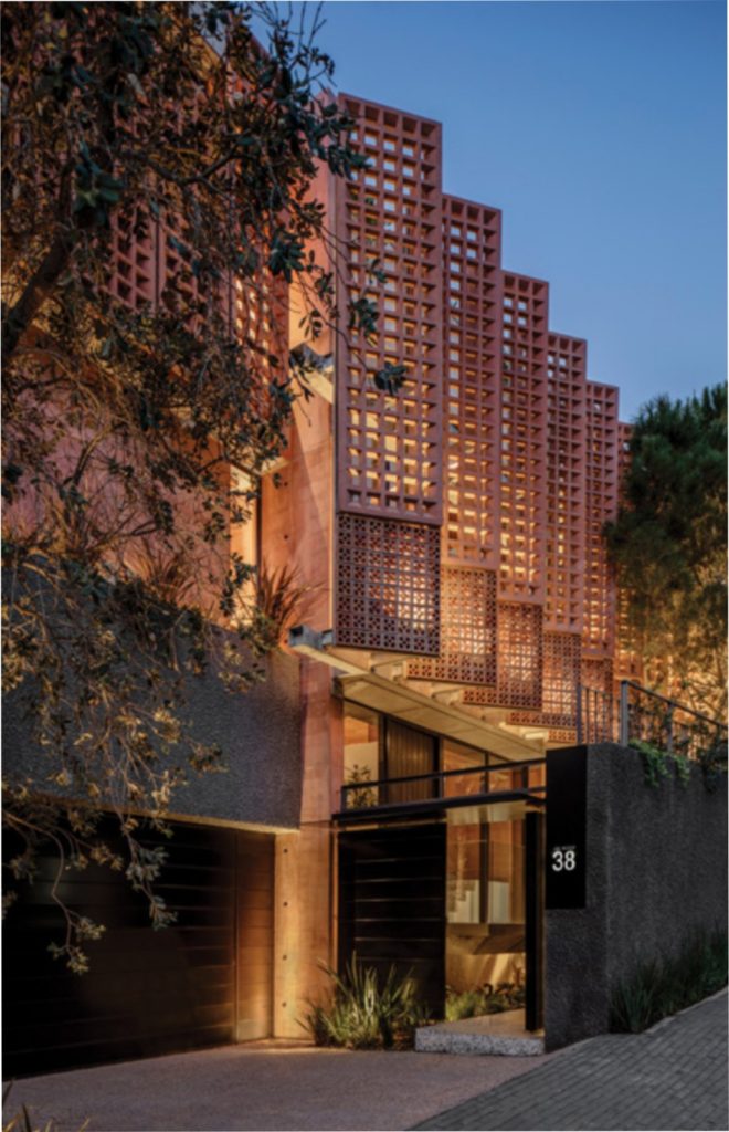
However, the building’s primary identity is imparted by the
distinctive red-pigmented off-shutter concrete of the
upper levels, especially the angled pre-cast concrete
screens mounted on steel frames, which provide shading
and privacy for the extensive façade glazing. The choice of
colour, Philip says, was partly based on memories of a trip
he and his family took to Mexico. He also, however, repurposed terracotta breezeblocks that formed part of the old boundary wall, which, he says, were “removed, stored,
sandblasted, brought back and built into the structural
steel screen”.
The colour, however, also expresses and emphasises the
raw materiality and texture of the concrete. Philip says that
he, like a lot of architects, “loves the way things are built”,
and something of that fascination and delight is built into
the tactile use of materials and expressive tectonic
elements of the facade.
Internally, the character of the house is best exemplified by
the main living space, which has been conceptualised as a
single, large, open-plan area that takes in the living room,
kitchen and dining rooms. These constitute a series of
overlapping, interconnected spaces, which is a distinctive feature of a SAOTA-designed homes, forming a flowing platform for living.
Philip says that the “contrast of crisp lines, clean
geometries and tactile finishes” is central to SAOTA’s
approach – “the idea of combining contemporary
design with natural materials to create an architecturally progressive space that is also a comfortable and
happy space to live in”.
Lighting, too, is fundamental to the experience of the
living space: “The whole upper level is characterised
by soft light,” says Philip. The screens, of course, filter
the light, but skylights, south-facing clerestories,
which let in a light that is “moderate and beautiful,”
and even high windows in the stairwell, which catch
the late afternoon light, are thoughtfully positioned.
While artificial lighting is unnecessary during the day,
at night, Philip has been sure that light falls in “warm
pockets” to “create interest” and variance, often
employing freestanding lights.
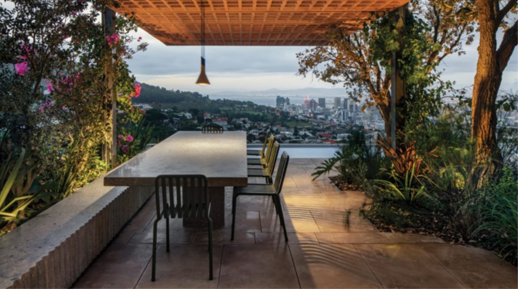
The seamless fusion of the interior and exterior
spaces, separated only by floor-to-ceiling glass
sliding doors that disappear completely when
opened, impart a palpable sense of place. As Philip
says, SAOTA’s most successful living spaces are
those in which the connection between interior and
exterior space is direct and uncomplicated.
The garden itself, however, includes “beautiful little
pockets of space framed by landscaping”. Philip says
he “absolutely loves” Spanish architect Ricardo
Bofill’s famous house built in a converted cement
factory. He’s always been enchanted by its simple,
generous, flowing spaces, raw materiality and the
way in which “the landscaping seems to invade the
building”. The wild, overgrown character of the landscaping of Philip’s own home constitutes a vision of
the happy co-existence of architectural and organic
elements.
The interiors introduce a new dimension of complexity and interest to Philip’s engagement with materials,
often including extensive research and development,
innovation and collaboration. The materials he’s
chosen for the interior finishes introduce a thoughtful
dialogue with the living heritage inherent in the skills
of artisans and craftsmen. The polished polymer
concrete floor, for example, used extensively over the
living room, floors, staircases and exterior paving, is
made with a green stone aggregate that is a byproduct from the historic copper mines in the Namaqualand area in the
Western Cape. Rustenburg granite is used for paving in some areas,
and local sandstone pavers around the pool and the dining outdoor
dining area.
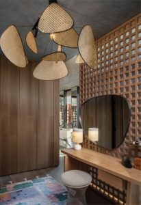
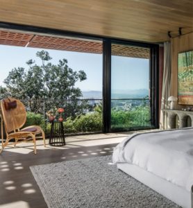
Solid stone features prominently in furniture pieces, too. Paarl granite, for example, was used for the striking four-piece server in the
living room, a console in the master bedroom and the basins, all crafted by JA Clift, a third-generation stone mason in Paarl known for
their work on the Afrikaans Language Monument.
Other heritage finishes referencing the 50s and 60s include the
hessian wall. The timber lattice ceiling design (a lightly stained locally
hardwood, Meranti, which complements the cast concrete screening)
adds richness and a sense of continuity between inside and out.
Other elements are more “quirky” or sentimental. “The breakfast
counter in the kitchen was the old dining table,” says Philip. “We modified it and mounted it on a stainless-steel counter.”
This fusion of this home’s exploratory engagement with materiality
and heritage, in conjunction with its bold aesthetics, proposes a creative solution to the city’s shifting urban context while making a striking addition to the suburban landscape.
UPPER ALBERT CREDITS:
Project Name
Upper Albert
Project Location
Cape Town, South Africa
Architects
SAOTA
Project Team
Riaz Ebrahim, Anthony Whittaker,
Michelle Mills, Casey Hunter
Interior Designer
ARRCC
Project Team
Mark Rielly, Nina Sierra Rubia, Anna
Katharina Schoenberger, Amy King
Structural Engineers
Moroff & Khune
Quantity Surveyor
Meyer Summersgill
Main Contractor
Red Sky Projects
Lighting Consultant
Martin Doller Design
Landscaping
Reto Mani Garden Services
Project Photographer
Adam Letch
Text by
Graham Wood
